Final Product
I was tasked with creating an advertisement for print that uses page layout, photo editing, and original illustrations.
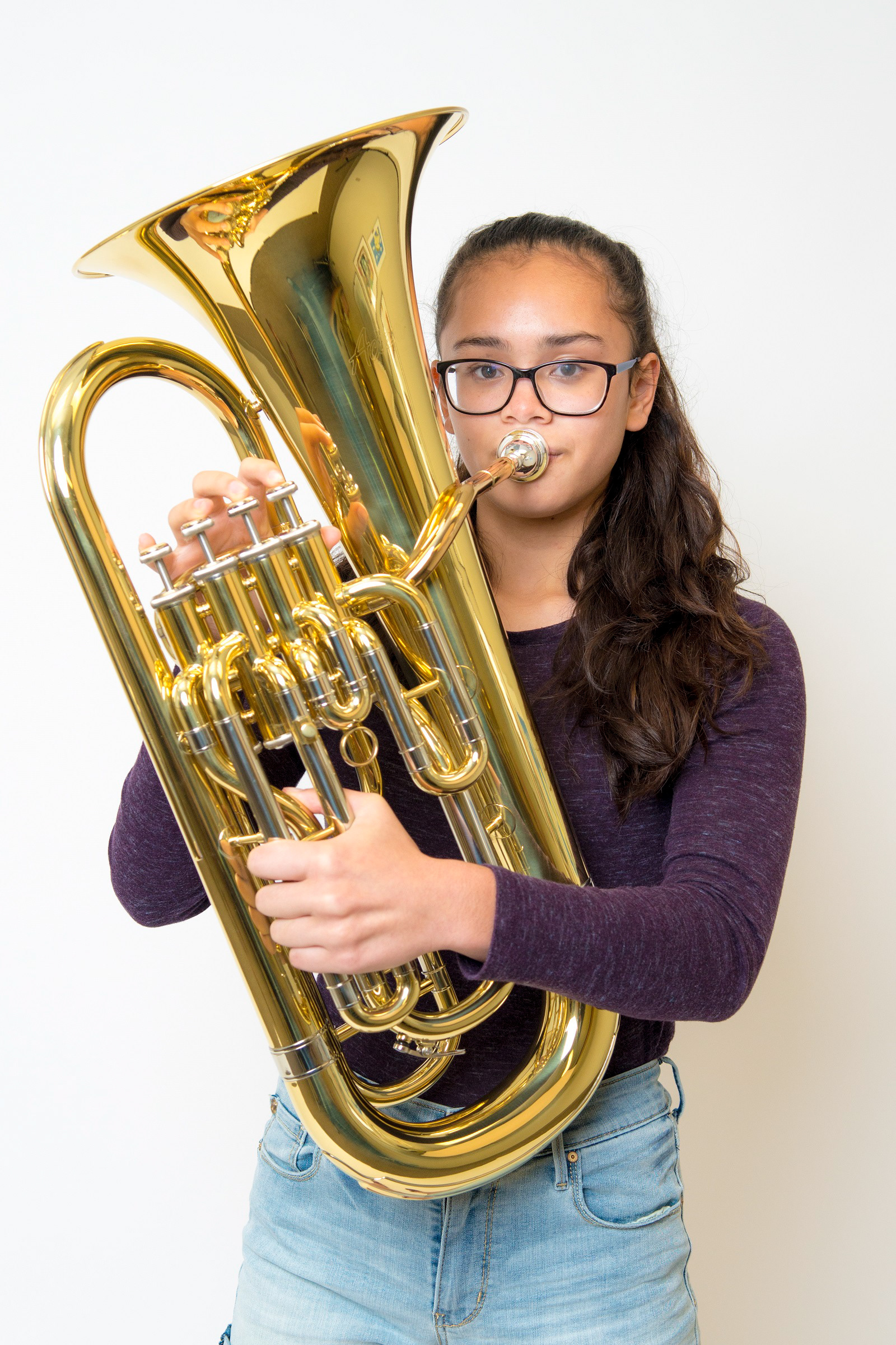
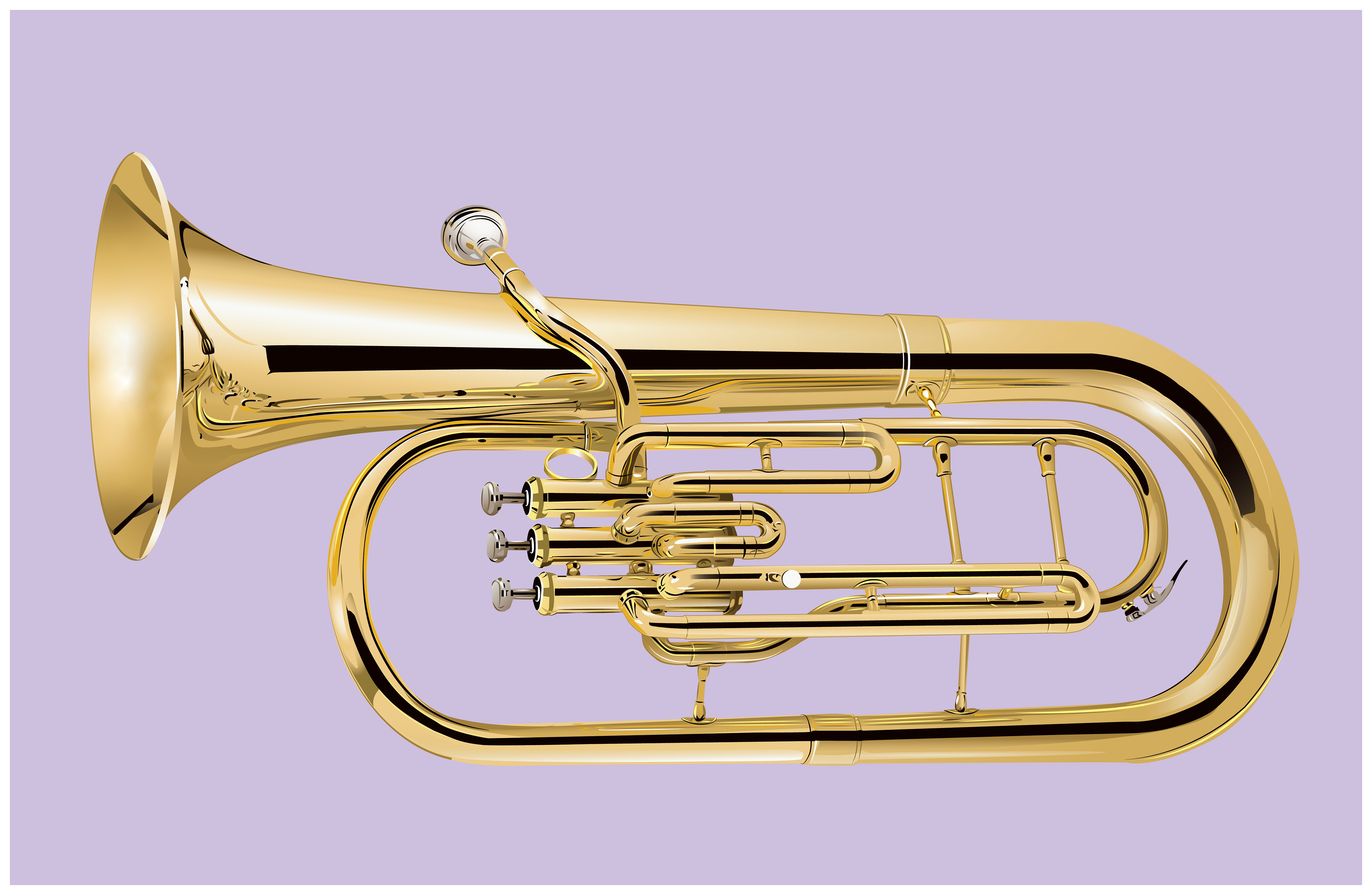
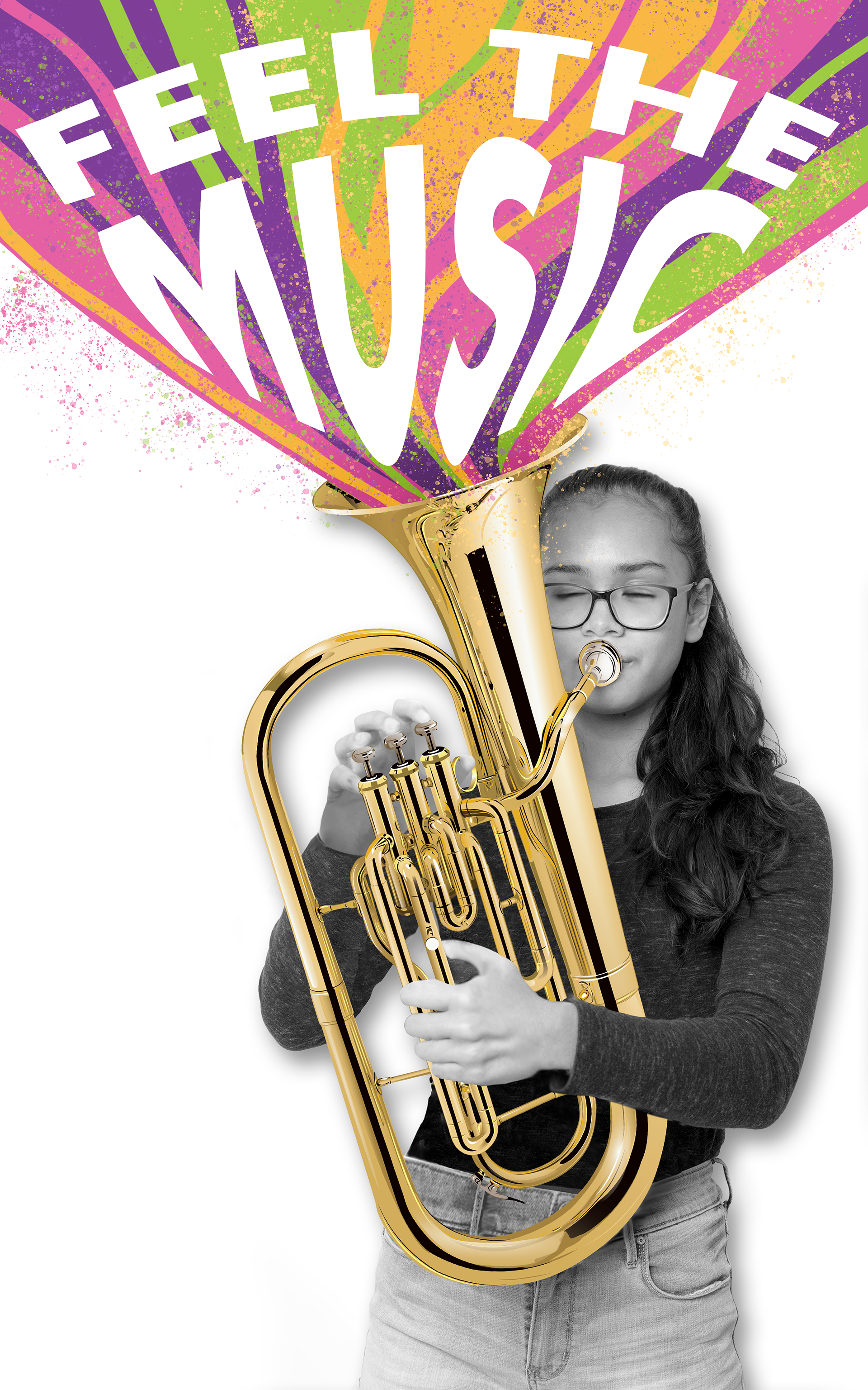
I had previously made an asset of a baritone tuba in Adobe Illustrator, and it had inspired me to do an ad for a music shop. In order to make the baritone tuba convincing, I primarily focused on the reflections within it. For this project specifically, I used Illustrator to create a logo for the music shop. I was allowed to use photos found online, so I was able to find a photo of a girl playing a baritone that would work well for an advertisement. Next, I used Photoshop to readjust the girl’s positioning of her arms and removed the existing instrument in her hands to make room for baritone illustration. To better grab people’s attention, I also added the phrase, “Feel the Music”, and warped it to emulate the swirling effect of the rainbow. Lastly, I took this result into InDesign and filled the remaining space with information about the music shop.
I had about four days to put this together, and overall, I believe it was a success. I’ll admit that the original photo of the girl had larger hands than normal and that I scaled them down to appear more convincing.

Photo of girl playing baritone found online

Baritone Tuba Asset made in Adobe Illustrator

Collage made in Adobe Photoshop

