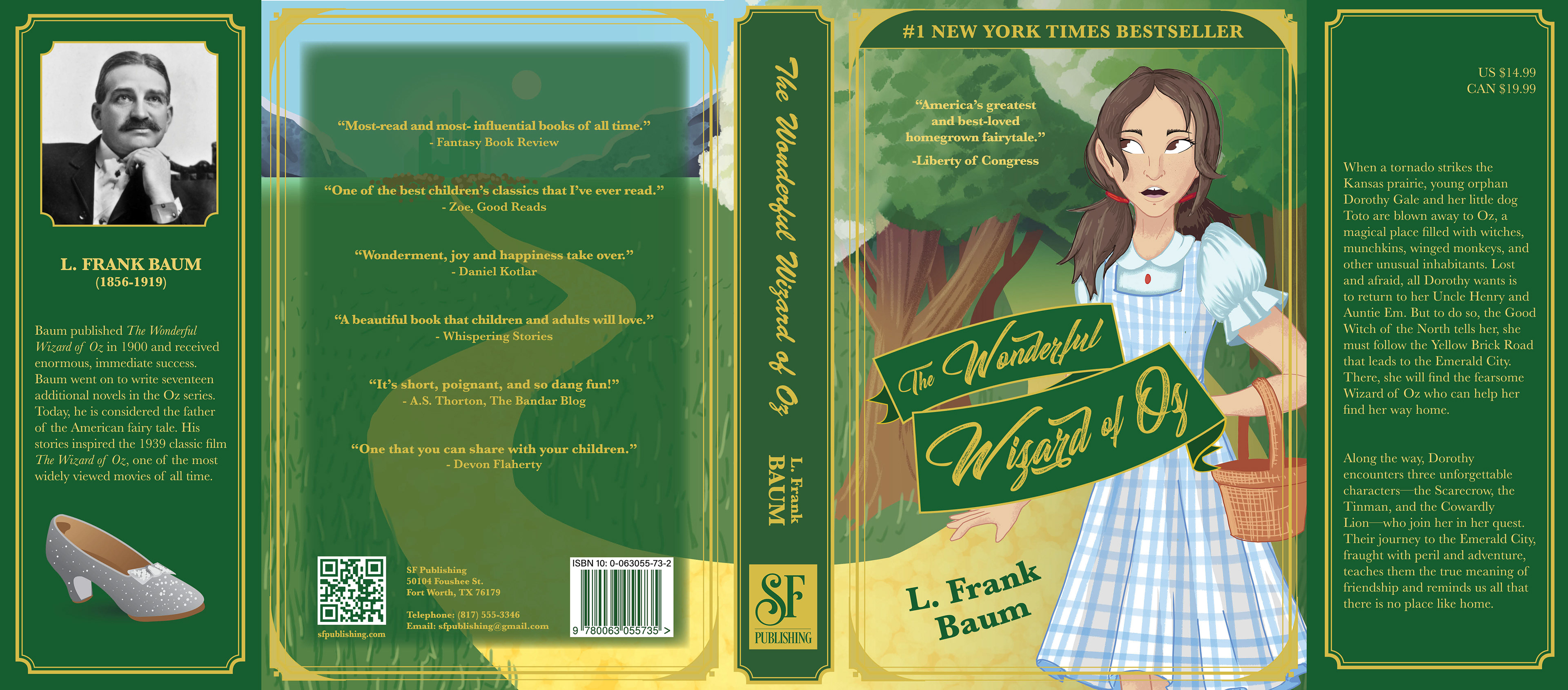
I created a layout both for the book cover for The Wonderful Wizard of Oz and for the contents within the book itself.
To design an original book cover, I started by sketching a few ideas and taking the winning sketch into Clip Studio Paint. Although I could’ve done this part in Illustrator, a more-traditional image with handmade strokes was desired and would be faster to achieve using a vectorized drawing program. Some assets, like the photo of L.B. Baum, the SF Publishing logo, and the barcode, were provided to me; but I made slight alterations so they better fit the overall look. Other assets, like the silver slipper and the title on the front, were made in Illustrator. If given the opportunity to redo it, I’d refine the illustration itself and add more ornate and subtle references to the contents of the book, such as poppies and Toto running towards Emerald City.
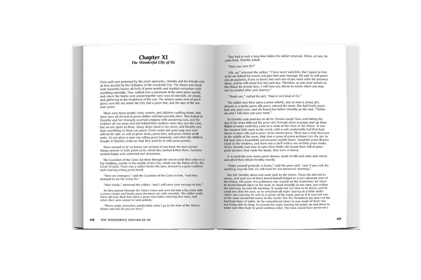
The formatted book includes a title page, a table of contents with clickable links, and the actual chapters within the book with page numbers. For the chapters in which Dorothy is in Kansas, I use Baskerville to both match the cover and create a more historical feel when reading. Meanwhile, for the time she resides in Oz, I use ITC Cerigo Std. to create a distinction between the two worlds explored in the book.